
[ 작성 순서 ]


# HTML 작성 #

HTML 작성
-ater, befor는 중복해서 사용할 수 없음
>> 세로선 적용을 위해서 div 그룹 하나 더 만듦
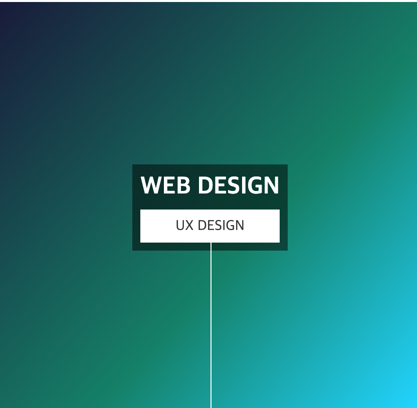
<body>
   <div class="style_1_wrap">
    <img src="images/18.png" alt="" />
       <div class="style_1">
           <div>  <!--ater, befer는 중복 사용 못하므로 세로선 적용위해 일부로 div로 묶음-->
                <h2>WEB DESIGN</h2>
                <p>UX DESIGN</p>
            </div>
       </div>
    </div>

</body>
# CSS 작성 #
#1. 기본값 주기
: body, div, img, h2, p 태그 요소에 공통으로 적용되는 값 주기
#2. 제일 큰 영역 세팅
>> .style_1_wrap{ }
: 이미지를 둘러싸고 있는 부모요소 style_1_wrap에 스타일 적용


1. 기본 모양 잡기
.style_1_wrap{
 width: 500px; height: 500px; margin: 50px auto;
 text-align: center;
 font-size: 18px;
 position: relative;
 color: #fff;
 overflow: hidden;
∴ position: relative; 자신이 포함하는 영역을 기준으로 위치값을 갖게 됨
overflow: hidden; ← style_wrap{} 영역(부모영역)을 넘아간 부분을 안보이게 함. so, 글자 안보임
2. 그라이던트 주기
 /*라인 그라디언트 주기*/
 background: rgb(0,4,36);
 background: linear-gradient(132deg, rgba(0,4,36,0.9004029088050315) 0%, rgba(7,126,103,1) 59%, rgba(0,212,255,1) 100%);
}
3.이미지 크기 조정 - style_1_wrap{} 과 동일하게 적용 → img { width: 500px; height: 500px; }
.style_1_wrap{ } 전체 코드
/* #1. reset*/
 body, div, img, h2, p{margin: 0; padding: 0}
 .style_1_wrap{
  	 	width: 500px; height: 500px; margin: 50px auto;
                text-align: center;
                font-size: 18px;
                position: relative;
                color: #fff;
                overflow: hidden;

		/*백그라운드에 라이너 그라디언트 주기 : https://cssgradient.io 사이트 참고*/
    	  background: rgb(0,4,36);
     	  background: linear-gradient(132deg, rgba(0,4,36,0.9004029088050315) 0%, rgba(7,126,103,1) 59%, rgba(0,212,255,1) 100%);
     }

   img{width: 500px; height: 500px; /*이미지 크기 조정*/
/*            visibility: hidden*/ /* 이미지 안보이게 함:배경 제대로 들어갔는지 확인 후, 삭제*/
     }
#3. 타이틀 박스 영역 세팅
>> .style_1{ }
: 박스 가운데로 놓고, 스타일 적용

/*  타이틀 박스 효과주기   */
     .style_1{
         position: absolute;
         bottom: 200px; left: 165px; padding: 10px;
         background-color: rgba(0,0,0,0.5);
         }
     .style_1 h2{ font-size: 30px;}

     .style_1 p{ background-color: #fff; color: #333;
         padding: 10px; margin-top: 10px
     }
▽ 비교해 보기 >> position: relative / position: absolute / overflow: hidden;
비교해보기
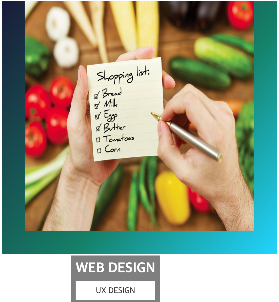
[그림1] position: relative 적용 X / position: absolute 적용 O )/ overflow: hidden; 적용 O(X)
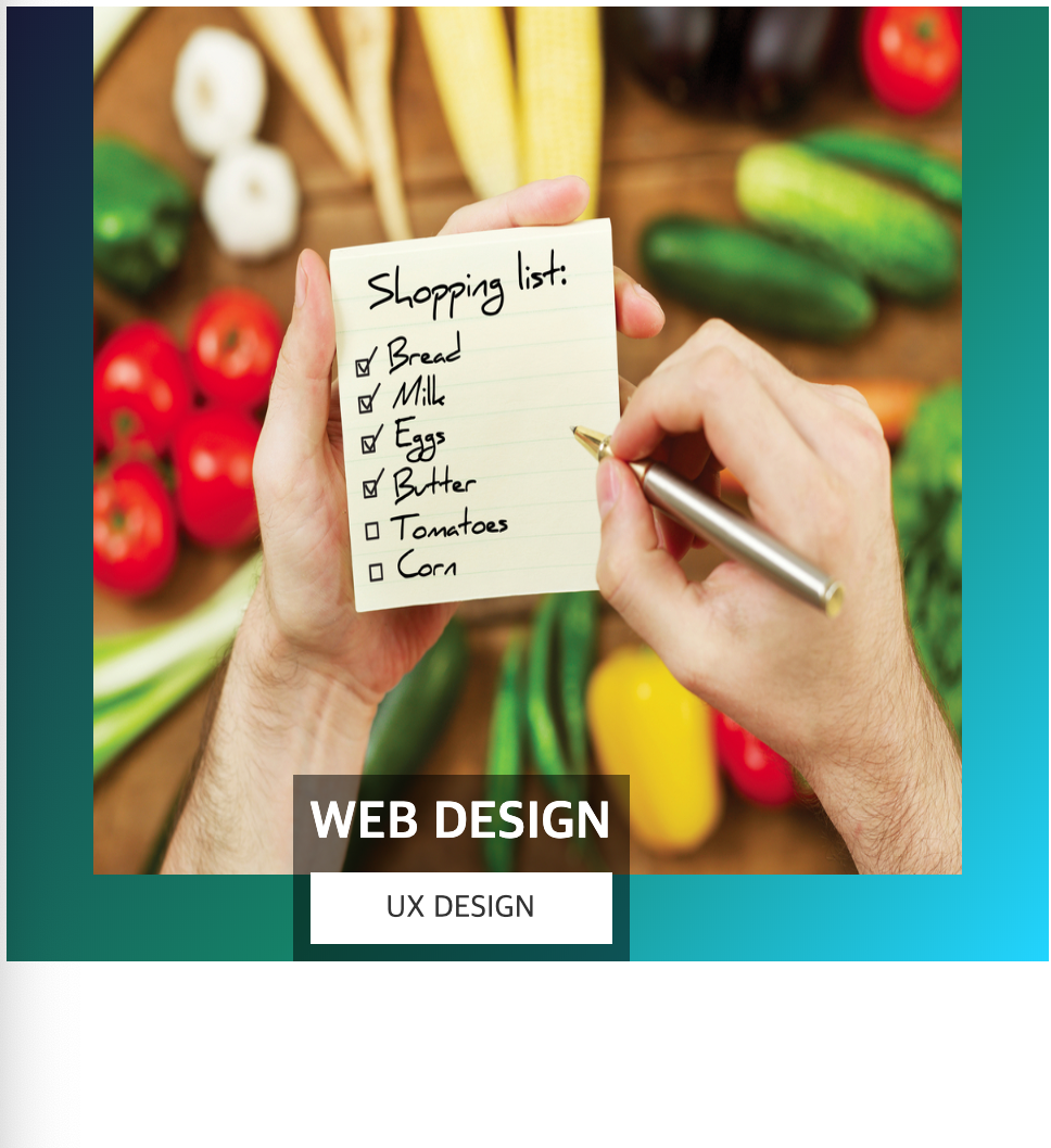
[그림2] position: relative 적용 O / position: absolute 적용 O ) / overflow: hidden; 적용 O(X)
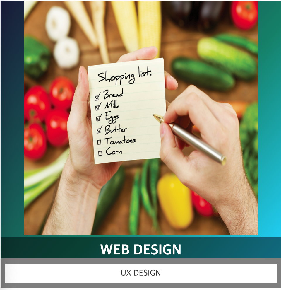
[그림3] position: relative 적용 O(X) / position: absolute 적용 X ) / overflow: hidden; 적용 O
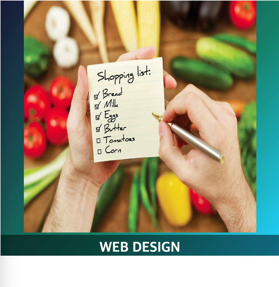
[그림4] position: relative 적용 O(X) / position: absolute 적용 X ) / overflow: hidden; 적용 X
position: relative (상대값)
: 자신이 포함하는 영역을 기준으로 위치값을 갖고 top, left, right, bottom 속성에 값을 상속하여 표현되도록 한다.
position: absolute (절대값)
: 자신을 포함하고 있는 컨테이닝(부모영역)을 기준으로 위치값(부모 영역 좌측 상단을 0,0으로 가짐)을 갖고 top, left, right, bottom 속성 값을 지정하여 표현할 수 있다. ※ 반드시 자신을 포함하고 있는 부모영역에는 position:relative가 되어 있어야 한다.
position:releative를 적용하지 않으면 바로 상위 부모 body에 적용된다(그림1참고)
overflow: hidden
: 자신을 포함하고 있는 포함된 부모영역을 넘어간 부분이 보이지 않게 함
.style_1_wrap{
                    width: 600px; height: 600px;  /* <-------수정하고 테스트 */
                    margin: 50px auto;
                    text-align: center;
                    font-size: 18px;
                    position: relative;  	/* <-------position: relative */
                    color: #fff;
                    overflow: hidden;  	/* <-------ovrflow: hidden */
/*라인 그라디언트 주기*/
         background: rgb(0,4,36);
         background: linear-gradient(132deg, rgba(0,4,36,0.9004029088050315) 0%, rgba(7,126,103,1) 59%, rgba(0,212,255,1) 100%);
         }
    img{  width: 500px; height: 500px; }
/*  타이틀 박스 효과주기   */
     .style_1{
            position: absolute;  	/* <-------position: absolute */
            bottom: 0px;  /* <--------- bottom 영역 0px으로 두고 테스트 */
            left: 165px; padding: 10px;
            background-color: rgba(0,0,0,0.5);
         }
     .style_1 h2{ font-size: 30px;}
     .style_1 p{ background-color: #fff; color: #333;
         padding: 10px; margin-top: 10px
     }
#4. 라인 넣기 : before, after 선택자 사용
>> 가운데 박스를 기준으로 라인 넣기
- 가로 라인 --> .style_1:befer,after{ } ,
- 세로 라인 --> .sytle_1 div: befor,after{}
: ※befor, after는 중복으로 사용 안됨으로 html작성시, .style_1 div를 추가로 만들어서 활용
/* befor, after 선택자 기본 코드*/
.클래스명:before {
  content: " ";
}
- .클래스명 :befor{}: 박스 태그 이전(박스 위)
- .클래스명 :after{}: 박스 태그 이전(박스 위)
4.1. 선 만들기
4.1.1. 가로선 만들기
.style_1:before{} : .style_{} 박스 태그 이전(박스 위)
.style_1:after{} : .style_{} )박스 태그 이후(박스 아래)

 .style_1:before,                       /* before -> style_1 박스 태그 이전(박스 위)*/
    .style_1:after{                     /* after  -> style_1 박스 태그 이후(박스 아래)*/
        content: '';
        width: 500px;
        height: 2px;
        background-color: #fff; /*흰색*/
        position: absolute; /*위치 값이 달라야 함으로 position 처리 해놓기*/
    }
4.1.2. 세로 선 만들기
.style_1 div:before{} : .style_1 div{} 박스 태그 이전(박스 위)
.style_1 div :after{} : .style_1 div{} )박스 태그 이후(박스 아래)

/*  세로 선 만들기  */
    .style_1 div:before, /* style_1 div 박스 태그 이전(박스 위)*/
    .style_1 div:after{  /* style_1 div 박스 태그 이후(박스 아래)*/
         content: '';
         width: 2px;
         height: 500px;
         background-color: #fff;
         position: absolute;
    }
가로선 코드와 width, height 값만 반대로 적고 나머지 같음
#5. 라인 이동 효과 적용 : transform: translast() 사용
5.1. 가로 선 이동 효과
5.1.1. 기준 원점&방향 &시작점 만들기
- transform: translate(100%)
> 사전에 정의(top:0, left:0)한 x축 중심점을 기준으로 양의 방향 100%지점에서 시작한다는 의미
- transform: translate(-100%)
> 사전에 정의(bottom:0, right:0)한 x축 중심점을 기준으로 음의 방향 100%지점에서 시작한다는 의미
/* 3.1.1_ 가로선 이동효과:before */
    /*선이 박스 오른쪽에서 왼쪽(안쪽)으로 그어져야 함*/
    .style_1:before {
         top:0; left:0; /*  원점(0,0)으로 사용할 위치? */
         transform: translateX(100%) /* x축 이동효과: 100% +x축 끝에서 시작 */
     }
/* 3.1.2. 가로선 이동효과:after */
    /*선이 박스 왼쪽에서 오른쪽(안쪽)으로 그어져야 함*/
    .style_1:after {
         bottom:0; right:0; /* 원점(0,0)으로 사용할 위치? */
         transform: translateX(-100%)/* X축 이동효과: 100% -x축 끝에서 시작 */
     }
5.1.2. hover 효과
: hover시 이동 방향&이동거리
/*  #4.   hover  */
  /* 라인이 바깥쪽 +100%/-100%에서 안쪽으로 들어와야되니까,
     0으로 넣어주어야 함 방향성(+,-)을 생각해야함 */
    /* 4.1 가로선 hover */
    .style_1_wrap:hover .style_1:before{
         transform: translateX(0)
        }
    .style_1_wrap:hover .style_1:after{
         transform: translateX(0)
        }
5.2. 세로 선 이동 효과 : 가로선과 반대로 적용
5.3. 이미지 hover 효과 : 안보이도록 처리
이동효과 & hover 전체 코드
/*  #3. 선 만들기 */
   /* 3.1. 가로 선 만들기  */
    .style_1:before, /* style_1 박스 태그 이전(박스 위)*/
    .style_1:after{  /* style_1 박스 태그 이후(박스 아래)*/
        content: '';
        width: 500px;
        height: 2px;
        background-color: #fff; /*흰색*/
        /*위치 값이 서로 달라야 함으로 position 처리 해놓기*/
        position: absolute;
    }

    /* 3.1.1_ 가로선 이동효과:before */
    /*선이 박스 오른쪽에서 왼쪽(안쪽)으로 그어져야 함*/
    .style_1:before {
         top:0; left:0; /*  원점(0,0)으로 사용할 위치?! */
         transform: translateX(100%) /* x축 이동효과: 100% +x축 끝에서 시작 */
     }
    /* 3.1.2. 가로선 이동효과:after */
    /*선이 박스 왼쪽에서 오른쪽(안쪽)으로 그어져야 함*/
    .style_1:after {
         bottom:0; right:0; /* 원점(0,0)으로 사용할 위치?! */
         transform: translateX(-100%)/* X축 이동효과: 100% -x축 끝에서 시작 */
     }


  /*  3.2. 세로 선 만들기  */
    .style_1 div:before, /* style_1 div 박스 태그 이전(박스 위)*/
    .style_1 div:after{  /* style_1 div 박스 태그 이후(박스 아래)*/
         content: '';
         width: 2px;
         height: 500px;
         background-color: #fff;
         position: absolute;
    }
    /* 3.2.1_ 세로선 이동효과:before */
    /*선이 박스 아래쪽에서 위쪽(안쪽)으로 그어져야 함*/
   .style_1 div:before {
         top:0; left:0;/*  원점(0,0)으로 사용할 위치?! */
         transform: translateY(100%)/* Y축 이동효과: 100% +Y 끝점(아래)에서 시작 */
     }
    /* 3.2.2_ 세로선 이동효과:after */
    /*선이 박스 위쪽에서 아래쪽(안쪽)으로 그어져야 함*/
   .style_1 div:after {
         bottom:0; right:0;/*  원점(0,0)으로 사용할 위치?! */
         transform: translateY(-100%)/* Y축 이동효과: 100% -Y 끝점(상단)에서 시작 */
     }

/*  #4.   hover  */
  /* 라인이 바깥쪽 +100%/-100%에서 안쪽으로 들어와야되니까,
     0으로 넣어주어야 함 방향성(+,-)을 생각해야함 */
    /* 4.1 가로선 hover */
    .style_1_wrap:hover .style_1:before{
         transform: translateX(0)
        }
    .style_1_wrap:hover .style_1:after{
         transform: translateX(0)
        }
    /* 4.2 세로선 hover */
    .style_1_wrap:hover .style_1 div:before,
    .style_1_wrap:hover .style_1 div:after{transform: translateY(0)}

    /* 이미지 안보이게 하기*/
    .style_1_wrap:hover img{opacity: 0;}
#6. 라인 노출 순서 & 노출 시간 처리 : transition-delay: __ s

/*  #6.  효과 노출 시간 적용*/
     .style_1_wrap:hover .style_1:before{transition-delay: 0.1s}
     .style_1_wrap:hover .style_1:after{transition-delay: 0.3s}
     .style_1_wrap:hover .style_1 div:before{transition-delay: 0.7s}
     .style_1_wrap:hover .style_1 div:after{transition-delay: 1s}
#7. 라인 이동 효과 자연스럽게 처리하기 : transition: all 0.5s ease;
/*  #5.  transition 효과:자연스러운효과 적용 */
     .style_1_wrap *,  /*style_1_wrap내부에 있는 요소 전체 선택*/
     .style_1_wrap *:before,
     .style_1_wrap *:after{transition: all 0.5s ease;
     }
cssgradient.io
코드 전체 보기
<!DOCTYPE html>
    <html lang="ko">
    <head>
    <meta charset="utf-8" />
    <meta http-equiv="X-UA-Compatible" content="IE=edge" />
    <title>H0305_css3_예제2</title>
    <meta name="robots" content="noindex, nofollow" />
    <meta name="keywords" content="-" />
    <meta name="description" content="-" />
    <meta name="author" content="-" />


<style>
/* #1. reset*/
    body, div, img, h2, p{  margin: 0px; padding: 0px; }
/* #2. .style_1_wrap 스타일 */
    .style_1_wrap{
                    width: 500px; height: 500px;
                    margin: 50px auto; /* 가운데 놓기*/
                    text-align: center; /*텍스트 가운데 놓기*/
                    font-size: 18px;
                    position: relative; /* 위치 잡기*/
                    color: #fff;
                    overflow: hidden; /* 크기 벗어나는건 hidden처리 */
        /*라이너 그라디언트 주기_백그라운드에 주기*/
         background: rgb(0,4,36);
         background: linear-gradient(132deg, rgba(0,4,36,0.9004029088050315) 0%, rgba(7,126,103,1) 59%, rgba(0,212,255,1) 100%);
         }
    /*이미지 크기 조정*/
    img{width: 500px; height: 500px;
/*            visibility: hidden; 배경 제대로 들어갔는지 확인 후, 삭제*/
     }

    /*  타이틀 박스 효과주기   */
    .style_1{
            position: absolute;
            bottom: 200px; left: 165px; padding: 10px;
            background-color: rgba(0,0,0,0.5); /*50% 투명도 들어간 검정색*/
         }
    .style_1 h2{ font-size: 30px;} /* h2태그 내부 스타일*/
    .style_1 p{ background-color: #fff; color: #333;
         padding: 10px; margin-top: 10px
     } /*p태그 내부 스타일 */

/*  #3. 선 만들기 */
   /* 3.1. 가로 선 만들기  */
    .style_1:before, /* style_1 박스 태그 이전(박스 위)*/
    .style_1:after{  /* style_1 박스 태그 이후(박스 아래)*/
        content: '';
        width: 500px;
        height: 2px;
        background-color: #fff; /*흰색*/
        /*위치 값이 서로 달라야 함으로 position 처리 해놓기*/
        position: absolute;
    }

    /* 3.1.1_ 가로선 이동효과:before */
    /*선이 박스 오른쪽에서 왼쪽(안쪽)으로 그어져야 함*/
    .style_1:before {
         top:0; left:0; /*  원점(0,0)으로 사용할 위치?! */
         transform: translateX(100%) /* x축 이동효과: 100% +x축 끝에서 시작 */
     }
    /* 3.1.2. 가로선 이동효과:after */
    /*선이 박스 왼쪽에서 오른쪽(안쪽)으로 그어져야 함*/
    .style_1:after {
         bottom:0; right:0; /* 원점(0,0)으로 사용할 위치?! */
         transform: translateX(-100%)/* X축 이동효과: 100% -x축 끝에서 시작 */
     }


  /*  3.2. 세로 선 만들기  */
    .style_1 div:before, /* style_1 div 박스 태그 이전(박스 위)*/
    .style_1 div:after{  /* style_1 div 박스 태그 이후(박스 아래)*/
         content: '';
         width: 2px;
         height: 500px;
         background-color: #fff;
         position: absolute;
    }
    /* 3.2.1_ 세로선 이동효과:before */
    /*선이 박스 아래쪽에서 위쪽(안쪽)으로 그어져야 함*/
   .style_1 div:before {
         top:0; left:0;/*  원점(0,0)으로 사용할 위치?! */
         transform: translateY(100%)/* Y축 이동효과: 100% +Y 끝점(아래)에서 시작 */
     }
    /* 3.2.2_ 세로선 이동효과:after */
    /*선이 박스 위쪽에서 아래쪽(안쪽)으로 그어져야 함*/
   .style_1 div:after {
         bottom:0; right:0;/*  원점(0,0)으로 사용할 위치?! */
         transform: translateY(-100%)/* Y축 이동효과: 100% -Y 끝점(상단)에서 시작 */
     }

/*  #4.   hover  */
  /* 라인이 바깥쪽 +100%/-100%에서 안쪽으로 들어와야되니까,
     0으로 넣어주어야 함 방향성(+,-)을 생각해야함 */
    /* 4.1 가로선 hover */
    .style_1_wrap:hover .style_1:before{
         transform: translateX(0)
        }
    .style_1_wrap:hover .style_1:after{
         transform: translateX(0)
        }
    /* 4.2 세로선 hover */
    .style_1_wrap:hover .style_1 div:before,
    .style_1_wrap:hover .style_1 div:after{transform: translateY(0)}

    /* 이미지 안보이게 하기*/
    .style_1_wrap:hover img{opacity: 0;}

/* #5 transition 효과:자연스러운효과 적용 */
     .style_1_wrap *,  /*style_1_wrap내부에 있는 전체 선택*/
     .style_1_wrap *:before,
     .style_1_wrap *:after{transition: all 0.5s ease;
     }

/*  #6.  효과 노출 시간 적용*/
     .style_1_wrap:hover .style_1:before{transition-delay: 0.1s}
     .style_1_wrap:hover .style_1:after{transition-delay: 0.3s}
     .style_1_wrap:hover .style_1 div:before{transition-delay: 0.7s}
     .style_1_wrap:hover .style_1 div:after{transition-delay: 1s}

</style>
</head>


<body>
   <div class="style_1_wrap">
    <img src="images/18.png" alt="" />
       <div class="style_1">
           <div>  <!--ater, befer는 중복 사용 못하므로 세로선 적용위해 일부로 div로 묶음-->
                <h2>WEB DESIGN</h2>
                <p>UX DESIGN</p>
            </div>
       </div>
    </div>

</body>
</html>


