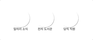
마우스 오버하면 아이콘 주변 회전

[ 작성 순서 ]
# HTML 작성 #

더보기
HTML
<body>
    <ul>
        <li class="link_group">
            <a href="#" class="link_box">
                <span class="link_icon link_icon1">
                    <em class="for_shadow"></em>
                </span>
                <em>일자리 소식</em>
            </a>
        </li>

        <li class="link_group">
            <a href="#" class="link_box">
                <span class="link_icon link_icon1">
                    <em class="for_shadow"></em>
                </span>
                <em>전자 도서관</em>
            </a>
        </li>

        <li class="link_group">
            <a href="#" class="link_box">
                <span class="link_icon link_icon1">
                    <em class="for_shadow"></em>
                </span>
                <em>당직 직원</em>
            </a>
        </li>

    </ul>
</body>
# CSS 작성 #
#1. 기본 세팅하기

더보기
reset
/* #1. reset*/
     body, ul, li, a, span, em{margin: 0; padding: 0; font-size: 12px; }
     em{
	    font-style: normal
     }
     ul{
    	list-style: none; width: 300px; margin: 50px auto
     }
     a{
    	text-decoration: none; color: #222
     }
     li{
    	display: inline-block; width: 90px; text-align: center
     }
     /*왜 width 값에 따라서 배치가 달라질까?  */
#2. 효과 적용
2.1 link_box

더보기
2.1 코드
.link_box .link_icon{ background-color: blue;
         display: block;
         width: 70px; height:  70px;
         margin: 0 auto;
         border-radius: 50%;
     }
2.2 그림자 넣기

더보기
2.2
/*그림자*/
.link_box .for_shadow{
background-color: yellow; /*배경 나중에 삭제*/
display: block;
width: 100%; height: 100%;
border-radius: 50%; box-shadow:
1px 1px 1px rgba(0,0,0,0.5)
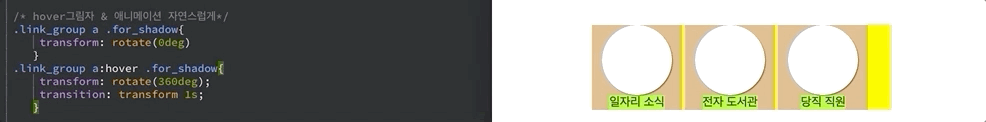
}2.3. hover 효과 적용
transform:rotate( 360deg) ← 그림자 회전
transition:transform 1s ← 자연스러운 처리
더보기
2.3
/* hover그림자 & 애니메이션 자연스럽게*/
     .link_group a .for_shadow{
         transform: rotate(0deg)
        }
     .link_group a:hover .for_shadow{
         transform: rotate(360deg);
         transition: transform 1s;
        }
2.4 icon 넣기

더보기
2.4
/*icon*/
     .link_icon1{
         background: url(images/slide_banner_ico01.png) no-repeat 50% 50% #0174f5  }
     .link_icon2{
         background: url(images/slide_banner_ico02.png) no-repeat 50% 50% #0174f5 }
    .link_icon3{
        background: url(images/slide_banner_ico03.png) no-repeat 50% 50% #0174f5 }
더보기
코드 전체 보기
<!DOCTYPE html>
    <html lang="ko">
    <head>
    <meta  charset="utf-8"/>
    <meta http-equiv="X-UA-Compatible" content="IE=edge" />
<title>0305_css3_예제5</title>
    <meta name="robots" content="noindex, nofollow" />
    <meta name="keywords" content="-" />
    <meta name="description" content="-"/>
    <meta name="author" content="-"/>

 <style>
     /* #1. reset*/
     body, ul, li, a, span, em{margin: 0; padding: 0; font-size: 12px; }
     em{
         font-style: normal
        }
     ul{
/*         background-color: yellow; 배경 나중에 삭제*/
         list-style: none;
         width: 300px;
         margin: 50px auto
        }
     a{
/*         background-color: greenyellow; 배경 나중에 삭제*/
         text-decoration: none;
         color: #222
        }
     li{
/*         background-color: burlywood; 배경 나중에 삭제*/
         display: inline-block;
         width: 90px;
/*         왜 width  값에 따라서 배치가 달라질까? */
         text-align: center
        }

     .link_box .link_icon{
/*         background-color: blue; 배경 나중에 삭제*/
         display: block;
         width: 70px; height:  70px;
         margin: 0 auto;
         border-radius: 50%;
     }
          /*그림자*/
     .link_box .for_shadow{
/*         background-color: white;  배경 나중에 삭제*/
         display: block;
         width: 100%; height:  100%;
         border-radius: 50%; box-shadow:
         1px 1px 1px rgba(0,0,0,0.5)
     }

     /* hover그림자 & 애니메이션 자연스럽게*/
     .link_group a .for_shadow{
         transform: rotate(0deg)
        }
     .link_group a:hover .for_shadow{
         transform: rotate(360deg);
         transition: transform 1s;
        }

     /*icon*/
     .link_icon1{
         background: url(images/slide_banner_ico01.png) no-repeat 50% 50% #0174f5  }
     .link_icon2{
         background: url(images/slide_banner_ico02.png) no-repeat 50% 50% #0174f5 }
    .link_icon3{
        background: url(images/slide_banner_ico03.png) no-repeat 50% 50% #0174f5 }


</style>
</head>


<body>

    <ul>
        <li class="link_group">
            <a href="#" class="link_box">
                <span class="link_icon link_icon1">
                    <em class="for_shadow"></em>
                </span>
                <em>일자리 소식</em>
            </a>
        </li>

        <li class="link_group">
            <a href="#" class="link_box">
                <span class="link_icon link_icon2">
                    <em class="for_shadow"></em>
                </span>
                <em>전자 도서관</em>
            </a>
        </li>

        <li class="link_group">
            <a href="#" class="link_box">
                <span class="link_icon link_icon3">
                    <em class="for_shadow"></em>
                </span>
                <em>당직 직원</em>
            </a>
        </li>

    </ul>

</body>
</html>


