
Html&CSS/html4,5 예제
0305_html5/css3_예제4
.Epona.
2020. 3. 9. 12:37
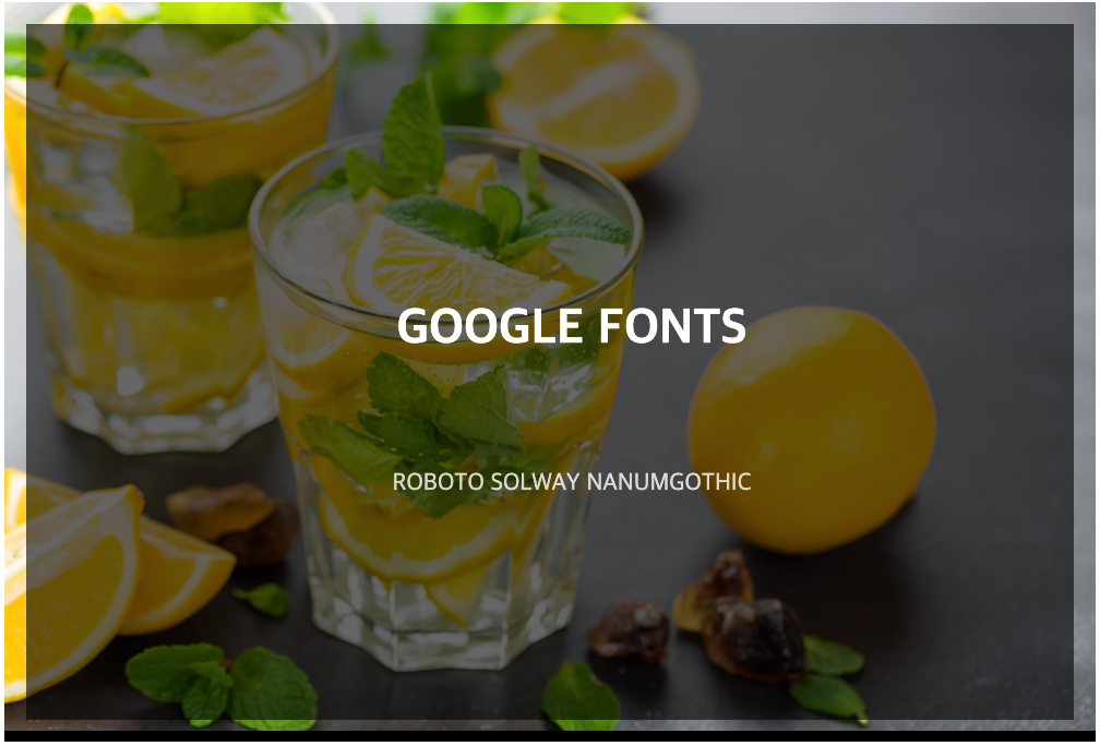
마우스 오버하면은 ...

[ 작성 순서 ]
# HTML 작성 #
더보기
HTML
<body>
  <div class="style_1_wrap">
    <img src="images/8.png" alt=""/>
      <div class="style_1">
        <h3>Google Fonts</h3>
        <ul class="links">
            <li><a href="#">Roboto</a></li>
            <li><a href="#">Solway</a></li>
            <li><a href="#">NanumGothic</a></li>
        </ul>
      </div>
  </div>

</body>
# CSS 작성 #
#1. 기본 세팅하기
- ul 점 없애기 >> list-sytle: none
- a {} 폰트 스타일 적용 >> text-decoration
더보기
reset
/* #1. reset*/
     body, div, img, h3, ul, li, a{ margin: 0; padding: 0;}
     ul{ list-style: none }
     a{ text-decoration: none; color:#fff}
#2. 가장 큰 박스 효과 적용
2.1 효과 적용: .style_1_wrap{ }
더보기
2.1 코드 전체
/* #2. 가장 큰 영역 reset */
     .style_1_wrap{
         position: relative;        /* 기준 위치 선언*/
         width: 500px;
         margin: 10px auto;         /*가운데 놓기*/
         overflow: hidden;          /* 영역 넘어가면 hidden*/
         text-align: center;        /*텍스트 가운데 정렬*/
         background-color: #000;    /* 검정색 */
         color:#fff;
         font-size: 16px;
         text-transform: uppercase;  /* 대문자로 변경*/
     }

/* #3. 자연스러운 효과 */
     .style_1_wrap *{
            box-sizing: border-box; /* 변수 무관하게 박스 사이즈 고정 */
            transition: all 0.35s ease}

/* #4. 이미지 크기 조정: #2와 동일한 크기로 */
    .style_1_wrap img{width: 500px;
         visibility: hidden;
/*        visiblility: hidden -> 이미지 안보이게 해줌 */
     }
#3. 텍스트 틀어간 박스 기본 스타일 적용
3.1 효과 적용: .style_1_wrap .style_1{ }
더보기
3.1 스타일
/* #5. styl_ 박스: 글자 들어간 박스 */
    .style_1_wrap .style_1{
        position: absolute;
        top: 0; bottom: 0px; left: 0px; right: 0; /* 위치값을 각각 찍어서 박스 만들수도 있음*/
    /*  position: absolute;
        top:0; left:0; width:100%; right: 100%; 로 박스 크기값을 만들어도 됨 */

         z-index: 1; /* z-index는 순서임 */
         opacity: 0; /* 투명도 0 */
         padding: 30px 10px -30px 0;
         background-color: rgba(0,0,0,0.6)
     }
3.2 hover 효과 적용
>> 텍스트 들어간 박스: .style_1_wrap:hover .style_1{ }
더보기
3.1 스타일
/* #5. styl_ 박스: 글자 들어간 박스 */
    .style_1_wrap .style_1{
        position: absolute;
        top: 0; bottom: 0px; left: 0px; right: 0; /* 위치값을 각각 찍어서 박스 만들수도 있음*/
    /*  position: absolute;
        top:0; left:0; width:100%; right: 100%; 로 박스 크기값을 만들어도 됨 */

         z-index: 1; /* z-index는 순서임 */
         opacity: 0; /* 투명도 0 */
         padding: 30px 10px -30px 0;
         background-color: rgba(0,0,0,0.6)
     }
#4. 텍스트 h3, li 스타일 적용
4.1 텍스트 들어간 박스: .style_1_wrap .links, .style_1_wrap h3{ }
>>같이 움직여야 함으로 묶어서 처리
더보기
4.1 스타일
style_1_wrap .links,
    .style_1_wrap h3{
         position: absolute;
         width: 500px;
         margin: 5px 0; padding: 0;
     }
4.2 h3, li 태그 스타일

더보기
4.2 스타일
/*  #8. h3 태그    */
     .style_1_wrap h3{bottom:50%; font-weight: 700; font-size: 1.4em }
/*  #9. li태그    */
     .style_1_wrap .links{top:50%; font-size: 0.7em;}
/*  #10. li태그 나란히 놓기   */
     .style_1_wrap .links li{
         display: inline-block; /* 글자 나란히 놓기 */
         opacity: 0;
         transform: translateY(40px)
     }
4.3 hover 효과 적용
>>
더보기
4.3 스타일
/*    hover : h3, li */
     .style_1_wrap:hover .links li{
         opacity: 1;
         transform: translateY(0px) /*#10에서 40밑으로 내린것 다시 위로 올리기*/
      }

     /*글자 딜레이 주기*/
     .style_1_wrap:hover .links li:nth-of-type(1){
         transition-delay: 0.1s;
     }
     .style_1_wrap:hover .links li:nth-of-type(2){
         transition-delay: 0.3s;
     }
     .style_1_wrap:hover .links li:nth-of-type(3){
         transition-delay: 0.5s;
     }
더보기
코드 전체 보기
<!DOCTYPE html>
    <html lang="ko">
    <head>
    <meta  charset="utf-8"/>
    <meta http-equiv="X-UA-Compatible" content="IE=edge" />
<title>0305_css3_예제4</title>
    <meta name="robots" content="noindex, nofollow" />
    <meta name="keywords" content="-" />
    <meta name="description" content="-"/>
    <meta name="author" content="-"/>

 <style>
/* #1. reset */
     body, div, img, h3, ul, li, a{ margin: 0; padding: 0;}
     ul{ list-style: none }
     a{ text-decoration: none;
        color:#fff}

/* #2. 가장 큰 영역 reset */
     .style_1_wrap{
         position: relative;        /* 기준 위치 선언*/
         width: 500px;
         margin: 10px auto;         /*가운데 놓기*/
         overflow: hidden;          /* 영역 넘어가면 hidden*/
         text-align: center;        /*텍스트 가운데 정렬*/
         background-color: #000;    /* 검정색 */
         color:#fff;
         font-size: 16px;
         text-transform: uppercase;  /* 대문자로 변경*/
     }

/* #3. 자연스러운 효과 */
     .style_1_wrap *{
            box-sizing: border-box; /* 변수 무관하게 박스 사이즈 고정 */
            transition: all 0.35s ease}

/* #4. 이미지 크기 조정: #2와 동일한 크기로 */
    .style_1_wrap img{width: 500px;
/*         visibility: hidden; */
/*        visiblility: hidden -> 이미지 안보이게 해줌 */
     }


/* #5. styl_ 박스: 글자 들어간 박스 */
    .style_1_wrap .style_1{
        position: absolute;
        top: 0; bottom: 0px; left: 0px; right: 0; /* 위치값을 각각 찍어서 박스 만들수도 있음*/
    /*  position: absolute;
        top:0; left:0; width:100%; right: 100%; 로 박스 크기값을 만들어도 됨 */

         z-index: 1; /* z-index는 순서임 */
         opacity: 0; /* 투명도 0 */
         padding: 30px 10px -30px 0;
         background-color: rgba(0,0,0,0.6)
     }

/*  #6. hover 효과:. style_1 */
     .style_1_wrap:hover .style_1{
         opacity: 1; /*opasity #5와 반대로 적용하면 되쥬 */
         position: absolute;
         top: 10px; left:10px; bottom: 10px; right: 10px;
         /* #5에서 top: 0; bottom: 0px; left: 0px; right: 0; 주었음으로
            hover 하면 안으로 10px씩 들어가게 됨 */
     }

/*  #7. li태그, h3 <--같이 움직여야 함으로 함께 묶어서 처리   */
    .style_1_wrap .links,
    .style_1_wrap h3{
         position: absolute;
         width: 500px;
         margin: 5px 0; padding: 0;
     }

/*  #8. h3 태그    */
     .style_1_wrap h3{bottom:50%; font-weight: 700; font-size: 1.4em }
/*  #9. li태그    */
     .style_1_wrap .links{top:50%; font-size: 0.7em;}
/*  #10. li태그 나란히 놓기   */
     .style_1_wrap .links li{
         display: inline-block; /* 글자 나란히 놓기 */
         opacity: 0;
         transform: translateY(40px)
     }


/*    hover : h3, li */
     .style_1_wrap:hover .links li{
         opacity: 1;
         transform: translateY(0px) /*#10에서 40밑으로 내린것 다시 위로 올리기*/
      }

     /*글자 딜레이 주기*/
     .style_1_wrap:hover .links li:nth-of-type(1){
         transition-delay: 0.1s;
     }
     .style_1_wrap:hover .links li:nth-of-type(2){
         transition-delay: 0.3s;
     }
     .style_1_wrap:hover .links li:nth-of-type(3){
         transition-delay: 0.5s;
     }

 </style>
</head>


<body>
  <div class="style_1_wrap">
    <img src="images/8.png" alt=""/>
      <div class="style_1">
        <h3>Google Fonts</h3>
        <ul class="links">
            <li><a href="#">Roboto</a></li>
            <li><a href="#">Solway</a></li>
            <li><a href="#">NanumGothic</a></li>
        </ul>
      </div>
  </div>

</body>
</html>
EX_html5_0305_ex4.html
0.00MB